How Seattle's NHL team became the Kraken
A behind the scenes look at how the team developed its name and logo.
HockeyFeed
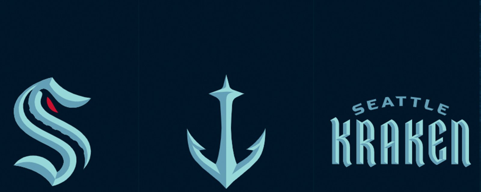
In case you missed the news earlier today, the Seattle Kraken officially unveiled their name, logos and jerseys to the world in an event staged from the construction grounds of the team's future home Climate Pledge Arena.
Check it out:
I gotta say... I'm not to keen on the team name, but the logo and jersey are absolutely incredible. I mean... just look at these colours:
That's a bad ass look no matter what the team is named.
About that name...
In her latest column, ESPN's Emily Kaplan pulls back the curtain a bit on just how the team came to the decision to name themselves. Check out some of these tidbits:
Seattle considered the Metropolitans -- the name of the city's original pro hockey team, which won a Stanley Cup in 1917 -- though there was some pushback from the league. The NHL has the Metropolitan Division, and commissioner Gary Bettman didn't want to change it for the sake of the new franchise.
Dettmer said the team monitored a Seattle Times reader poll that garnered more than 146,144 votes. Though the Seattle Times' poll narrowed it down to Sockeyes and Totems as finalists, Kraken had a strong showing.
It's unclear who first suggested Kraken internally, though film producer Jerry Bruckheimer, another part-owner of the team, has used the mythical sea creature in his Pirates of the Caribbean movies. Fans latched on. So did Seattle's branding committee. Around Christmas 2019, the group was all but settled on it.
"We had to make sure it wasn't a cartoon character or something silly," Merrill said. "Also, it's the tradition of the sea; you don't mess around in the sea. If you mess around in the ocean, you get sucked in, and you die. It commands some seriousness, which we knew we had to hit."
In one meeting, Leiweke said: "There's nothing more frightening than the theater and the mystery of the mind." Merrill's mental gears began spinning, thinking of Alfred Hitchcock movies in which you don't see the killer, but you know he's out there.
The "S" as the primary mark is an homage to the original Seattle Metropolitans uniforms.
"But while you're seeing the S, and thinking about the Metropolitans, thinking about the colors, that negative-space tentacle is hiding there, wrapping around your ankles, ready to pull you down," Merrill explained.
The logo was almost finished, but Merrill knew it needed something else. Then came the "aha" moment, provided by majority owner David Bonderman.
"Bonderman was like, 'You should put the eye right there,' and pointed to the top of the S," Merrill said. "I thought it was going to be terrible, actually. But we tried it, and it looks pretty good."
For the full article, click below:
Source: Emily Kaplan

- Jonathan Larivee
NHL prospect facing multiple charges following DUI crash.
- NHL News
- 2 minutes read

- Chris Gosselin
Elliotte Friedman stuns when revealing which team will shock everyone at the trade deadline
- NHL News
- 2 minutes read

- Trevor Connors
Rumblings of tampering allegations between Rangers and Canucks
- NHL News
- 5 minutes read


