PWHL unveils their 6 new team names on Monday.
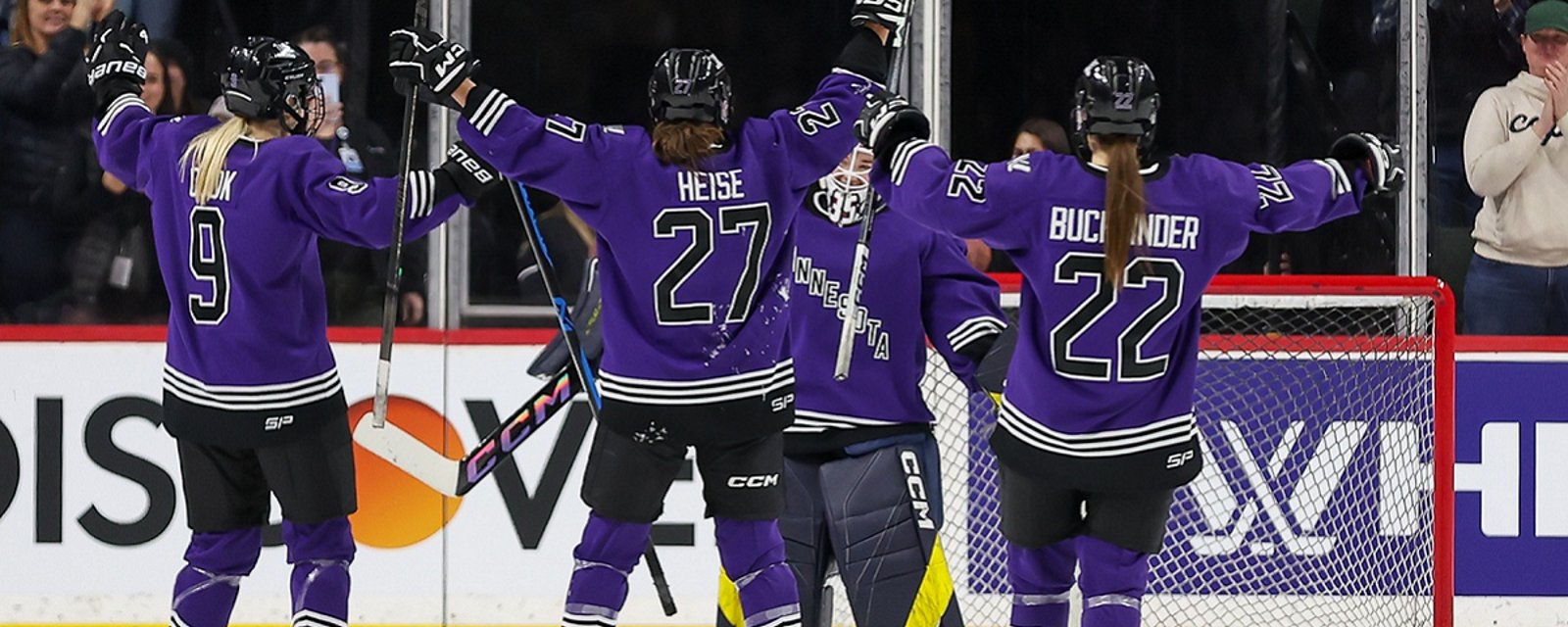
The PWHL is rebranding their inaugural 6 teams, with 6 new names for Boston, Minnesota, Montreal, New York, Ottawa and Toronto.

The Professional Women's Hockey League is re-launching what they have branded as their inaugural six after the initial launch was not so well received.
On Monday, the PWHL re-introduced their franchises to the the world although this time each team was accompanied by a brand new team name and a matching logo to go along with it. The six teams will be based in the same locations, that is to say Boston, Minnesota, Montreal, New York, Ottawa and Toronto, but they will sport a different look than they did in the league's debut season.
The new names are the following:
Boston Fleet
Minnesota Frost
Victoire de Montreal
New York Sirens
Ottawa Charge
Toronto Sceptres
As mentioned each team was introduced with a new logo and you can see each one of those just below. Additionally you can see a stylized version of each team name, done with the team colors in mind, for each of the teams as these were also released today by the PWHL.
I think it would be fair to say that the reaction to the new names and logos has been relatively mixed, with some fans expressing positive feelings towards the new designs while others have been more critical.
After a quick glance at many of the responses it would seem that Montreal is coming away as the big winner of today's announcement with most positive responses highlighting how much they enjoy the new name and logo. On the other hand, Ottawa and Toronto appear to be taking the brunt of the criticism, with many fans feeling the Ottawa logo too closely resembles that of the Calgary Flames, while in the case of Toronto the 'Sceptre' name just simply does not seem to be resonating with many of those who have responded to the announcement.
What I really want to know though is what do you think of today's announcement? And more importantly, who is the biggest winner and the biggest loser when it comes to the new logos? Let me know in the comments.
- Jonathan Larivee

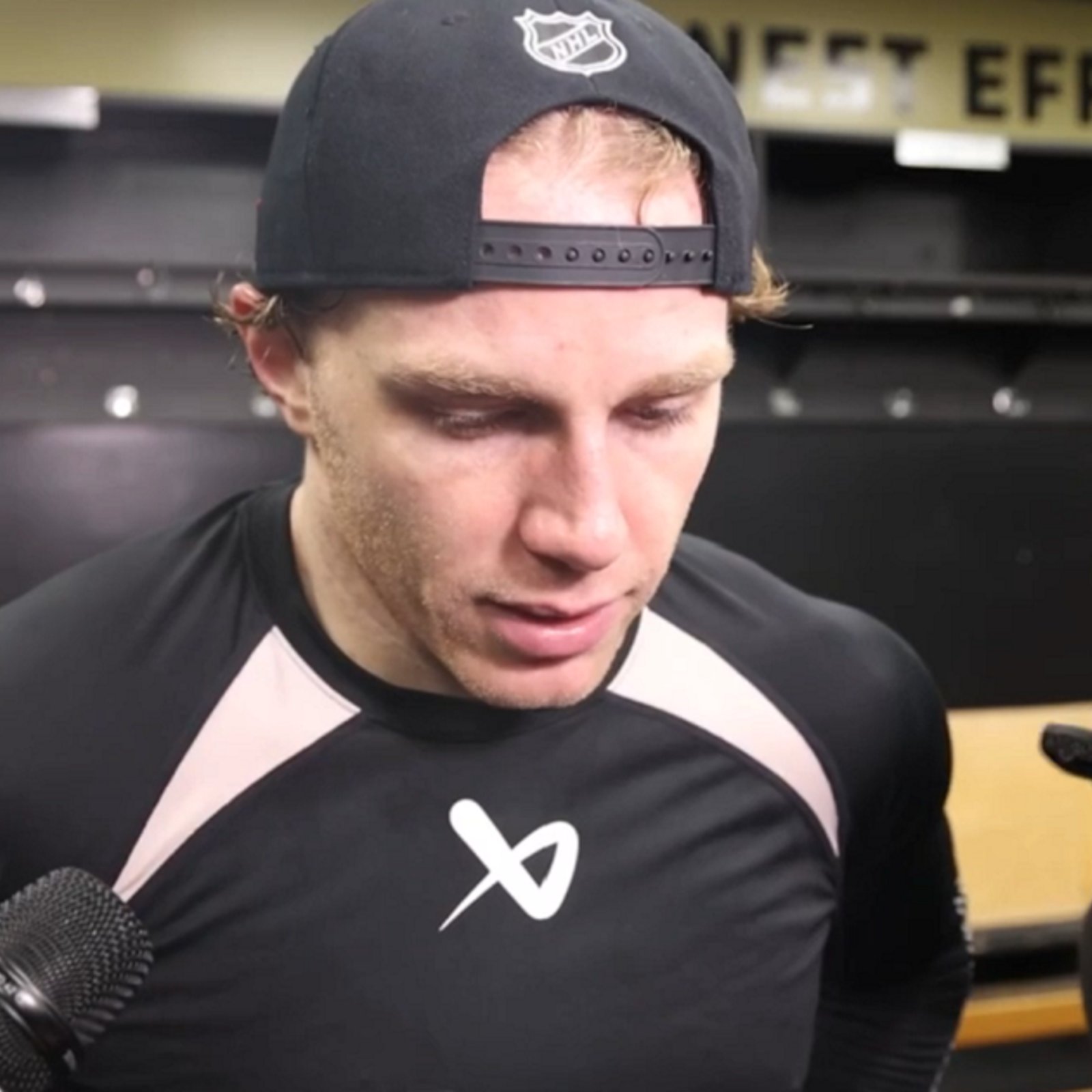
Patrick Kane responds to Canadians booing American national anthem.
- NHL News
- 2 minutes read
- Jonathan Larivee
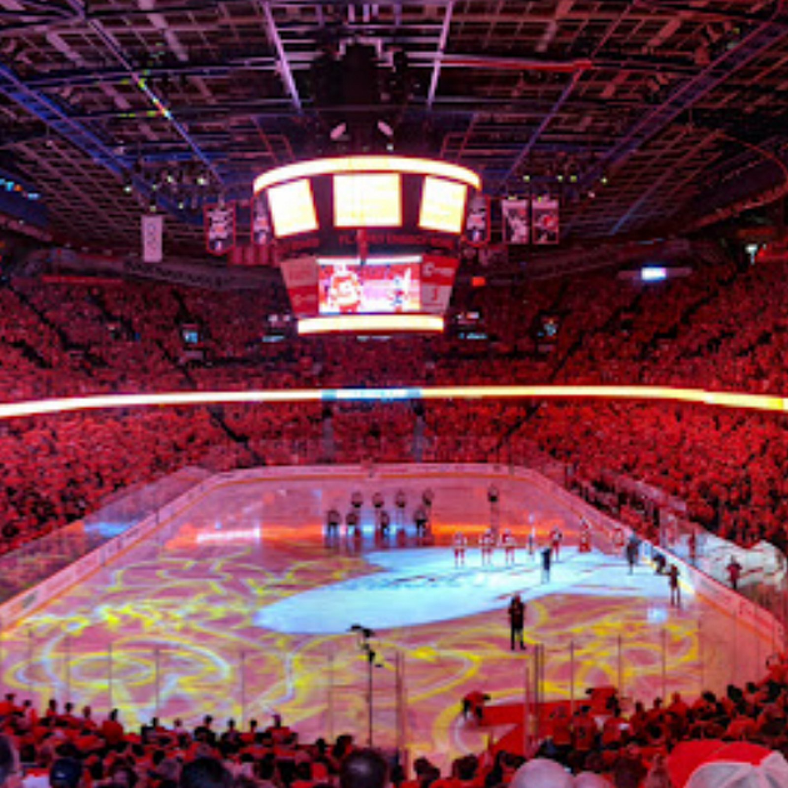
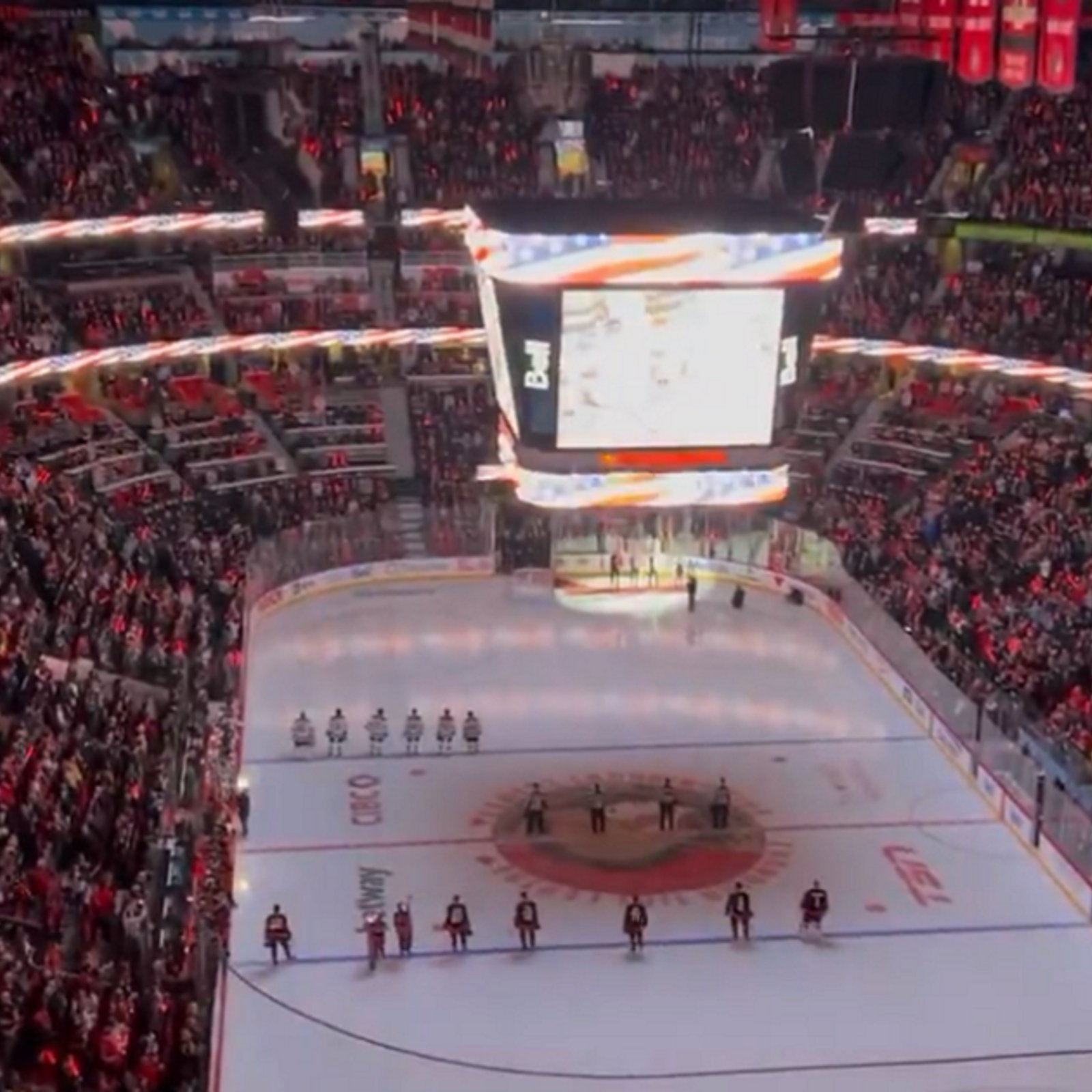
Second group of Canadian NHL fans boo American national anthem.
- NHL News
- 2 minutes read
- Jonathan Larivee
Canadian fans boo American national anthem during NHL game.
- NHL News
- 2 minutes read